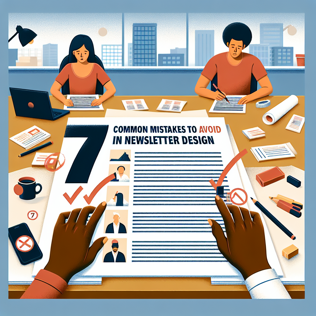
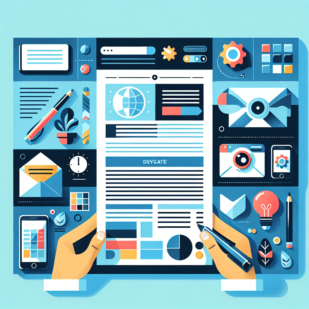
7 Common Mistakes to Avoid When Designing Newsletters
7 Common Mistakes You Can Make When Making Designing newsletters Should be avoided
Introduction
Welcome to the exciting world of Designing newsletters ! If you thought that creating a newsletter was as easy as putting together a shopping list, then you haven't experienced the challenges and pitfalls that lurk on the way to the perfect newsletter template. Here's the deal: A well-designed newsletter can make your Email Marketing to a whole new level, while a poorly designed newsletter can make your subscribers unsubscribe faster than a bad movie.
In this post, we will look at the 7 most common mistakes that people do when designing newsletters. Whether it's the Layout for newsletters or the integration of interactive elements – we cover everything! But don't worry, we're not just here to criticize; we also give you valuable Newsletter design tips to avoid these stumbling blocks.
Tip of the day: An effective newsletter design combines creativity with ease of use. Remember, your readers are human too – they want engaging and easy-to-understand content!
Before we dive into the details, let's take a look at some of the most important trends in responsive newsletter design. Imagine that your newsletter is like a good dish – the ingredients must be carefully selected and prepared to perfection. So, if you're ready to spice up your newsletter design and avoid potential mistakes, buckle up! It will be an exciting journey through the world of creative newsletter ideas!
Mistake 1: Lack of Target group analysis
Designing a newsletter without a thorough Target group analysis It's like cooking a dish without knowing who's sitting at the table. You could use the best ingredients, but if your audience isn't interested in what you're serving, the food will become cold and inedible.
Precise target group analysis is the key to successful Designing newsletters . It's important to know not only who your readers are, but also what they're interested in and what problems they're having. Here are some points to consider:
- Demography: Age, gender, and location can greatly influence your content.
- Interests: What inspires your readers? What topics attract them?
- Behaviour: Analyze the opening behavior of your previous emails. Which content was clicked on the most?
- Feedback: Use surveys or direct feedback to learn more about your subscribers' preferences.
One of the most common mistakes in email marketing is to assume that all recipients are the same. This often leads to generic content and a lack of engagement. Instead, you should design your newsletter templates to cater to different segments of your target audience.
Tip: Use A/B testing for different newsletter designs and content. This will help you find out what resonates best with your target audience.
Creative newsletter ideas for different target groups
Once you have a good understanding of your target audience, you can play with creative ideas. Here are some suggestions:
- Topic-based newsletters: Adapt your content seasonally or to current events.
- Personalized content: Use the recipient's name or specific interests in the address.
- Interactive elements: Include polls or quizzes to increase engagement.
Ultimately, the better you know your target audience, the more effective your newsletter will be. A well-founded analysis not only helps you to design the layout for newsletters, but also to determine the Conversion rate of newsletters considerably. So grab your notebook and start researching!
Mistake 2: Confusing layout for newsletters
Imagine you enter a restaurant and the menu looks like a puzzle book – confusing, chaotic and without a clear structure. This is what it feels like when recipients come across a confusing newsletter. One poor layout for newsletters can dilute even the best content and cause your readers to lose interest.
An effective newsletter design is like a well-oiled clockwork: everything has to work together in harmony. Here are some common mistakes you should avoid at all costs:
- Too many elements: If your layout is overloaded with images, text, and graphics, the reader will be overwhelmed.
- Bad typography: Don't use more than two or three fonts. Too many styles only confuse.
- Unclear hierarchy: Important information should stand out. Use colors and font sizes strategically!
- Lack of consistency: Stick to a color scheme and design style. A patchwork of different styles is a deterrent.
Responsive newsletter design
Another important aspect of newsletter design is responsiveness. According to a study by Litmus, 47% of emails open on mobile devices. If your layout isn't mobile-friendly, you'll lose almost half of your target audience! Make sure your newsletter templates look good on different devices.
Tip: Test your layout with different email clients and devices to make sure everything works smoothly!
Creative newsletter ideas to improve the layout
Ready for some inspiration? Here are some creative approaches to designing your newsletter:
- Storytelling: Use stories to structure your content and emotionally engage the reader.
- Interactive elements: Include polls or quizzes to actively engage readers.
- Graphics in email marketing: Use engaging graphics and images to create visual interest.
- Call-to-action in the newsletter: Place clear calls to action in strategic places in the layout.
Ultimately, your goal should be to create a user-friendly newsletter design that is both informative and engaging. Avoid chaos and focus on clarity – your readers will thank you!
Take your time for a good design!
Mistake 3: Lack of responsiveness in newsletter design
Imagine you have a great newsletter that looks like a masterpiece. But then your subscribers open it on their smartphones and it looks like a puzzle where the pieces don't fit. That's every email marketer's nightmare!
In this day and age, it is imperative that your Newsletter design is responsive. According to the latest statistics, the 60%of users send their emails on mobile devices. If your newsletter layout isn't optimized for different screen sizes, you're not only risking readability, but also the overall user experience.
Why Responsiveness Matters
A responsive design means more than just pretty graphics; it directly affects the conversion rate of newsletters. Here are some reasons why you should pay attention to this:
- Better user experience: When your readers can interact with a well-structured newsletter layout, they're more likely to read and act on your content.
- Higher open rates: An appealing design increases the chance that readers will reopen your newsletter or even recommend it to others.
- Competitive advantage: Many companies neglect this aspect; if you do it right, you will stand out from the crowd.
Creative Approaches to Responsive Design
Let's go over a few creative ideas to make sure your HTML newsletter always looks good:
- Simple column layouts: Use a maximum of two columns in your layout. This ensures that content is easy to read even on smaller screens.
- Optimize images: Make sure your email marketing graphics are compressed and have responsive properties (z.B. max-width: 100%).
- Tip for typography for emails: Choose fonts and sizes that are comfortable to read on both desktop and mobile devices.
Ultimately, it's all about creating a user-friendly newsletter design. If your audience has a great experience on any device, they'll be more willing to click and convert. So remember: responsiveness is not a luxury – it's a necessity!
Next step: Check your current newsletter templates for responsiveness and make adjustments if necessary!
Mistake 4: Ignoring call-to-action items
Imagine you go to a restaurant, and the waitress brings you a delicious menu, but she forgets to tell you how to order. Frustrating, isn't it? This is how it feels when your readers open your newsletter and don't have any clear Call-to-action elements to find. In the world of Email Marketing these elements are crucial!
An effective call-to-action (CTA) is like a signpost on a highway – it shows drivers exactly where they need to go. So, if you want your readers to click, buy, or sign up, you need to make sure that your CTAs are not only in place, but also eye-catching and engaging.
Tip: Use eye-catching colors and clear text for your CTAs. It's also a good practice to place the buttons at the top of your newsletter layout.
Why are CTAs so important?
CTAs aren't just pretty buttons; they are the key to increasing your Conversion rate of newsletters . If you don't actively ask your readers to take action, you risk them just keep scrolling and ignoring your content. Here are some key points:
- Clarity: Make it clear what the next step is – whether it's downloading an e-book or registering for a webinar.
- Visibility: Place the CTAs strategically in the newsletter layout; ideally at the top and end of the content.
- Appealing wording: Use active language such as "Register Now" or "Click Here" to create urgency.
- A/B testing: Test different CTA versions (colors, texts) to find out what resonates best with your target audience.
Creative newsletter ideas for CTAs
Let's get a little more creative! Here are some innovative approaches to call-to-action elements in your newsletters:
- Embedded videos: Add a CTA in a short video – this will increase interactivity!
- Special offers: Offer exclusive discounts just for newsletter subscribers – this motivates them to act!
- Pulsating buttons: Use animations or color changes – it will attract attention!
In summary: Don't ignore the power of call-to-action elements! When your readers know what to do next and why they should act, they'll be more likely to respond to your offer. Make it easy for them – and watch the results of your email campaigns increase!
Mistake 5: Excessive text and poor typography for emails
When it comes to the Designing newsletters less is often more. Excessive text can quickly turn readers off, like an uninvited guest at a party who never stops talking. Instead, you should focus on getting your message across clearly and concisely.
Here are some tips to improve the readability of your emails:
- In a nutshell: Keep paragraphs short. Long blocks of text are the enemy of attention.
- Visual hierarchy: Use headings and subheadings to structure the text.
- Use bulleted lists: Lists help to grasp information quickly – perfect for quick review!
- Creative newsletter ideas: Incorporate graphics or interactive elements to break up the content.
Typography for emails
The choice of font is crucial! A poorly legible font can ruin even the best content. Here are some key points about typography:
- Type size: Make sure your font size is at least 14px – anything less than that could be illegible to mobile readers.
- Contrast: Make sure that the text is easy to read. A high contrast between the background and font color is a must!
- Record: Avoid using more than two different fonts in a newsletter; this causes unrest in the layout.
Did you know? Studies show that well-designed emails can achieve an open rate of up to 50% – that's 20% more than poorly designed ones! If your newsletter design isn't right, you're likely to lose valuable readers.
Use email templates
Email templates can help you save time while ensuring an appealing design. There are many free and paid options to choose from. Use these templates as a starting point and customize them to match your brand!
Finally, remember that your readers don't have time to wade through a jumble of text. Keep it simple and engaging! If they're comfortable with your newsletter, they'll be more inclined to keep reading it and respond to your call-to-action elements.
Mistake 6: Insufficient image optimization and graphics in email marketing
If you thought that images in your newsletter were just decorative accessories, then you made a big mistake! Pictures are the rock stars of your email marketing and should be treated accordingly. But how do you optimize them properly?
Why Image Optimization Is Important
Imagine you have the perfect layout for your newsletter, but the images load so slowly that your readers have long since lost interest. According to a study, 47% of users of a website if they have to wait longer than 2 seconds for an image to load. Not only is this frustrating, but it's also a missed opportunity for your conversion rate!
Tips for image optimization in newsletters
- Use compressed formats: JPEGs for photos and PNGs for graphics are often the best options.
- Responsive Designs: Make sure your images look good on all devices. A flexible newsletter layout is a must!
- Inserting alt texts: These not only help with accessibility but also improve your SEO.
- Creative Graphics: Use engaging and relevant graphics – think infographics or illustrations that support your message.
- Consistent colors and typography: Stick to your branding! Uniform colors in the newsletter design create recognition.
Images as a call-to-action
Images can do more than just look pretty – they can also act as a call-to-action! For example, link to your latest product or blog post with an eye-catching image. If done well, it will make the reader click and learn more.
Tip: Test different image formats and sizes with A/B testing. Find out what works best and continuously optimize!
Common misconceptions about images in email marketing
- Pictures are not important: False! The right graphics can work wonders.
- Emails should be image-heavy: Too many images can negatively affect the loading time. Balance is key!
- Rely only on text: Visual content significantly increases engagement!
Ultimately, it's about finding a harmonious balance between text and graphics. The right design of your newsletter can be the difference between a click and an ignorance. Remember: a well-designed newsletter is like a good dish – it needs the right ingredients in the right amount!
Mistake 7: Lack of personalization and interactivity in newsletters
When it comes to the Designing newsletters , the motto: "One for all" is simply no longer up to date. In a world where we are constantly surrounded by tailored offers and personalized experiences, it is a serious mistake to send newsletters that look like mass-produced goods.
Why personalization is important
Imagine receiving a newsletter that ignores your interests and preferences. Feels like an uninvited guest at a party, right? According to a study by HubSpot personalized emails increase the open rate by up to 26%. This clearly shows that the more you tailor your content to the recipient, the more engagement you can expect.
Personalization tips
- Use names: Start your emails with the recipient's name. A simple "Hello Max!" can work wonders.
- Target group analysis: Use data about your subscribers' behavior to tailor content. What did they click? What products did they view?
- Segmentation: Divide your subscribers into groups. Send different newsletters to different target groups – so everyone stays relevant!
Insert interactive elements
Nothing screams boredom like a static newsletter! Add interactive elements to increase engagement. Here are some creative ideas:
- Let your readers participate and express their opinions.
- Clickable graphics: Use graphics with links to relevant content or products.
- Customizable content: Allow readers to adjust their preferences directly in the newsletter.
Email templates for better design
Let's say you have all these great ideas for personalized and interactive elements. Now you may be wondering, "How do I implement this?" That's where professional newsletter templates come in! These will help you create a responsive newsletter design that looks great on both desktop and mobile.
Creative newsletter ideas are just the beginning! Use A/B testing in email marketing to find out which personalized content works best. And don't forget: Storytelling in newsletters can work wonders – tell stories from the point of view of your target group!
Ultimately, if your subscribers feel like your newsletter was made specifically for them, they'll be more willing to click and convert. Make your next newsletter an experience – because boring was yesterday!
Result
The Designing newsletters is an art in itself and requires a fine sense of detail. By avoiding the most common mistakes, you can not only improve the usability of your newsletters, but also improve the Increase conversion rate . Who doesn't want their readers to be left with their mouths open and a click on the call-to-action button?
Remember, a well-designed newsletter is like a well-prepared dish. The right ingredients (content), an appealing presentation (layout) and the perfect timing (sending time) are crucial!
Here are some key points to consider when Newsletter design should keep in mind:
- Target group analysis: Understand your readers. What interests them? What content do they expect?
- Layout for newsletters: Keep it clear and engaging. An overloaded design can turn off readers.
- Responsive newsletter design: Make sure your emails look good on all devices.
- Call-to-action in the newsletter: Place clear calls to action to encourage interaction.
- Images and graphics: Use optimized graphics to create visual interest.
- Creative newsletter ideas: Experiment with interactive elements to increase engagement.
Let's say you've created fantastic content, but your layout looks like a chaotic puzzle. That won't convince anyone! Make sure your typography is reader-friendly and use colors strategically to evoke emotion and draw attention.
Ultimately, optimizing newsletters for mobile is no longer a luxury – it's a necessity. With the rise of mobile usage, your email needs to be accessible everywhere. And don't forget about A/B testing! It helps you figure out what works best for your target audience.
Ready to incorporate these tips into your next campaign? Then let's go! Make your newsletter a real experience for your readers – because every click counts!